Saturday, June 30, 2012

stretching and growing


let me introduce you to mr gerald brommer. he is who i spent the last week with, along with about 20 other people taking his class.

our first day was all about line and shape. i am normally not much of one for sketching or drawing, but, i needed to give it a whirl....so here is one of my first.

this was also from the first day now with my color shape. i was feeling the abstract.

this was from day 2....the color is actually collage papers that were tinted with watercolor.
this was from day 3 and one of my favorites!! i actually had someone who wanted to buy it from me at class, but, i was selfish and kept it for myself.....

Monday, June 25, 2012

tag....

i wanted to participate with the tag making from artspeciallyfriends.blogspot.com . this is the tag i made yesterday.

the back is pretty simple; although, the numbered tag at the top is a metal tag i made with white paint, stamps, and UTEE from an earlier post this year.

Sunday, June 24, 2012

cotton flowers

these are the flowers in my front beds. blowing in the breeze this morning.

they reminded my of raw cotton.

i am loving these crazy fluffy little flowers.

Thursday, June 21, 2012

thank you cards

hand made thank yous for my great friends who helped with graduation. this is the front.

this is the back....loving my glimmer mist and diamond stencil.

have to have a matching envelope! with a little stitching....

here is my second one....with some stamping and a little more india ink and some fabric scraps....

and the back....

Monday, June 18, 2012

lesson

lesson in patience.....i had this idea for a painting for my new kitchen and somehow in my head the vision is layered, lovely and perfect. however, (and this is where the patience comes in), my painting and my style are not ones that come in the first swing through. probably not even on the second or third-(i normally lose count)....and when i am thinking "holy cow this is ugly" and let it sit and "cook", then, somewhere deep within i hear the whisper of what to do next. what layer of color i need, or layer of ink, paper, pencil....and very slowly, i usually come to something to i like. so after a rocky start, my painting was whispering for turquoise and india ink. the ink may have gotten a little OC. can you tell?...but, i sure did have a good time. stop back...to see my kitchen painting and see what my fuss is about.

Saturday, June 16, 2012

summer toes

we are now in summer mode- all ready for flip flops with our cute toes!

Friday, June 15, 2012

friday fill ins

and here we go....
  1.  it's always nice when you can steal an unplanned lunch with a friend and catch up.
  2. i like to hear that little whisper to try anything in my studio...what if i did this...
  3. positive color; negative space.
  4. this is a painting that is "cooking" above...listening for my little whisper for what to do next.
  5. what i heard was "what if you could not fail?"
  6. often i search on pinterest (so addictive, but, love it all the same).
  7. and as for the weekend, tonight i'm looking forward to staying home, tomorrow my plans include a junk run and flea markets, and sunday, i want to paint/ journal in my studio.

Thursday, June 14, 2012

kitchen: before and after

this was my kitchen- classic old house galley-type kitchen with cabinets and countertop on the shortest wall in the kitchen! that was all the storage and countertop i had.....my window view above the sink was onto the roof of the business that is next door to us. lovely. the other boxed in window was so high on the wall that unless i was standing right in front of it, i really could not see out of it. it also did not open. what was its' purpose?

this is my kitchen now!!! this is that same wall. i realized the stove is right there, but, there is bountiful countertops on either side of the stove, with quick access to the storage.

this was my other window. it also was classic old house in the fact that it was huge. i loved my color before (marigold), but, it was time for a change!

this is looking on that same wall....a lovely window now looks out onto our backyard.

our new refrigerator stands basically where that big old window was.

this is is my south wall, and that counter top was a span of 12 feet. 12 feet! we did go with a laminate countertop after looking at all types. it reminds me of how i paint....it is almost like having spots be worn through to show other colors. it looks rather neutral, but, it is clay colored with purple showing through, and at night, has a much greener hue that i would have expected, but, looks great with the purple walls.

this is our new lights in the room. i love the artistic look and feel. i wanted some sort of a drum type light. i was actually shooting for a burlap drum type light, but, i could not get my husband there. he was not understanding my textural feel i was going for....oh, well. i got the shape i wanted, and i do still like these.

these are my new lights over the sink. i am so loving the industrial feel of these matching up with my arty drum lights. my new color is a deep purple. i put that onto 3 walls, with the other walls being a clay colored with white trim. i love the colors!

this is a peek into my stove. after much discussion and debate, we went with a stove with 2 ovens. this is looking into the top one. love the color. we did not do the floor yet due to our time constraint (graduation....), but, we will get it caught up here soon now that things are calming down.

Tuesday, June 12, 2012

back in the saddle

i finally had time on sunday to play in my art journal.

a little ink, stencil, watercolor pen, stickers, sewing, scraps....makes me happy!

the purple blob under the little purple flower is a used papertowel- nothing is garbage in my studio sometime. i like the simplicity of this page.

not completely sure this page is finished, but, i am happy so far with what i have....we will see.

and this is a new art journal i purchased. it came all the way from poland hand-made by czekoczyna! she is an amazing mixed media artist! my journal is filled with a variety of paper- book paper, envelopes, postcards--it is so cool! if you have not visited her blog, you can click on the banner in the right hand corner of my blog or click here.

Sunday, June 10, 2012

vintage beauties

i had planted the vintage hollihocks last year and i must have forgotten, and pulled it thinking it was a weed. i had bought black velvet and regular packets and was so bummed when nothing really came at the end of the season and i remembered what i had done. hollihocks were a flower that seemed to be at every farmhouse when i was a kid, or if there was an "older- gramma type" living at the house- they would have these flowers. i think i liked them because they were so tall. so now that i have a flower garden, i wanted these vintage beauties in MY garden. (if i would stop pulling them....)

so this year i was going to be patient and wait to see what this plant was growing in the corner of my garden. so a week ago at graduation, my mother in law was looking at the garden, and was so pleased to see the hollihocks growing. i have been patiently waiting to see if the flower was the regular variety or the black velvet ones....yesterday the flowers started to open!!! i was so excited to see the black velvet vintage beauty!

Thursday, June 7, 2012

birthday card

i made a birthday card for our oldest son yesterday who finally turned 18! he is one of the youngest in his graduating class.

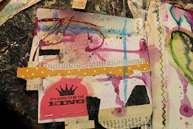
i used many "scraps" i had found around the house....edge of paper sack, used paper towel (loved the purple!!), masking tape, top edge of cat food bag- yes i did! also used india ink and stitching. good day!

Wednesday, June 6, 2012

thank you's.....

final step in this graduation process....the thank you! i made thank you postcards.

with matching envelopes!

i was using blank notecards that i trimmed to fit my envelopes. i sprayed them outside on the driveway. i actually lined up 6 cards underneath the stencil at a time.

this was the stencil i used, (which i love!).

these are the spray paint colors i used- ivy leaf and primer grey. i did a light spray with the ivy green just enough to get some color onto the cards and a little heavier with the grey to fill in more and give definition to the stencil. this gave the cards a variegated look that i liked. the final step was to stamp the "thank you" onto the front.